I am so so so excited to share this post today. It's been over 3 months in the making, and while still not 100% completed, it's basically done and worth sharing. We have put a lot of work into making this kitchen our own and did the entire thing ourselves (and with the gracious help of my father-in-law) and couldn't be prouder/happier of our first renovation project!
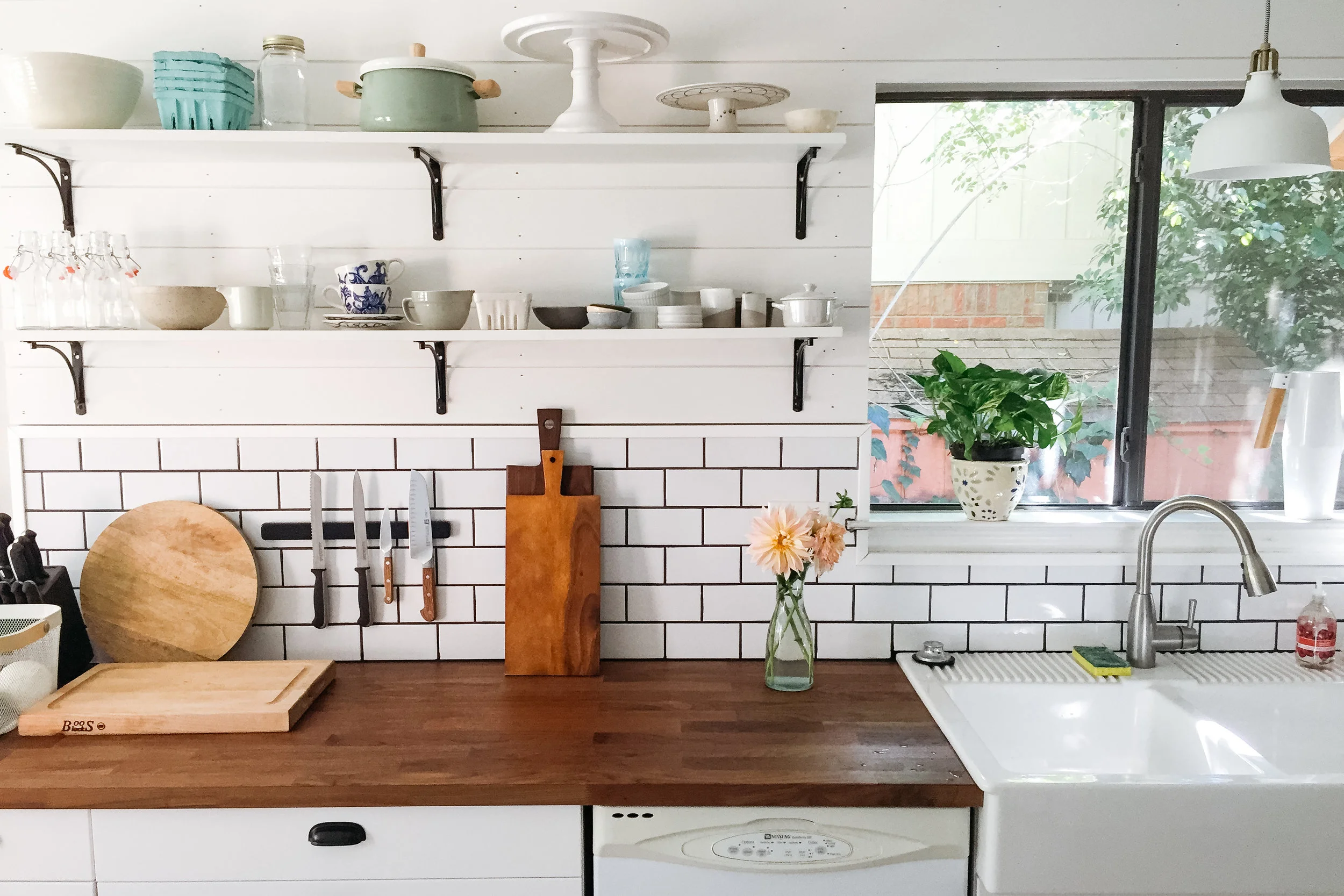
When we bought our 1980s house, the first thing on my long list of renovation projects was to redo the kitchen. I've always dreamed of renovating a kitchen and making it my own. Since I spend a lot of time in the kitchen with work, I wanted a space that felt like me and suited our lifestyle. Our goal with the space was to make it more open and bright and airy. I wanted to combine my two loves of modern/clean lines and farmhouse/rustic. I'm very happy with the results and think we accomplished what we both had in mind!
As you can see from the photos (although, they really do not do it justice!) the kitchen looks completely different than before. When we moved in the kitchen had popcorn ceilings, old cabinets that had been painted blue, laminate countertops and a pretty small double sink. It also didn't have a backsplash, except for a piece of metal behind the stove.
It also had this very large wall with a small entryway separating the kitchen from the dining/living room. Maybe you noticed it in the photos?
Kyle and my father-in-law demoed the wall, which was a pretty big project that took a few weeks. Of all the things we have done so far, this has created the biggest difference. It is so much more open now into the rest of the house, creates a natural flow between rooms, and allows so much more light in than before. I am so glad they did it and am eternally grateful for their persistence in what was a pretty daunting project!
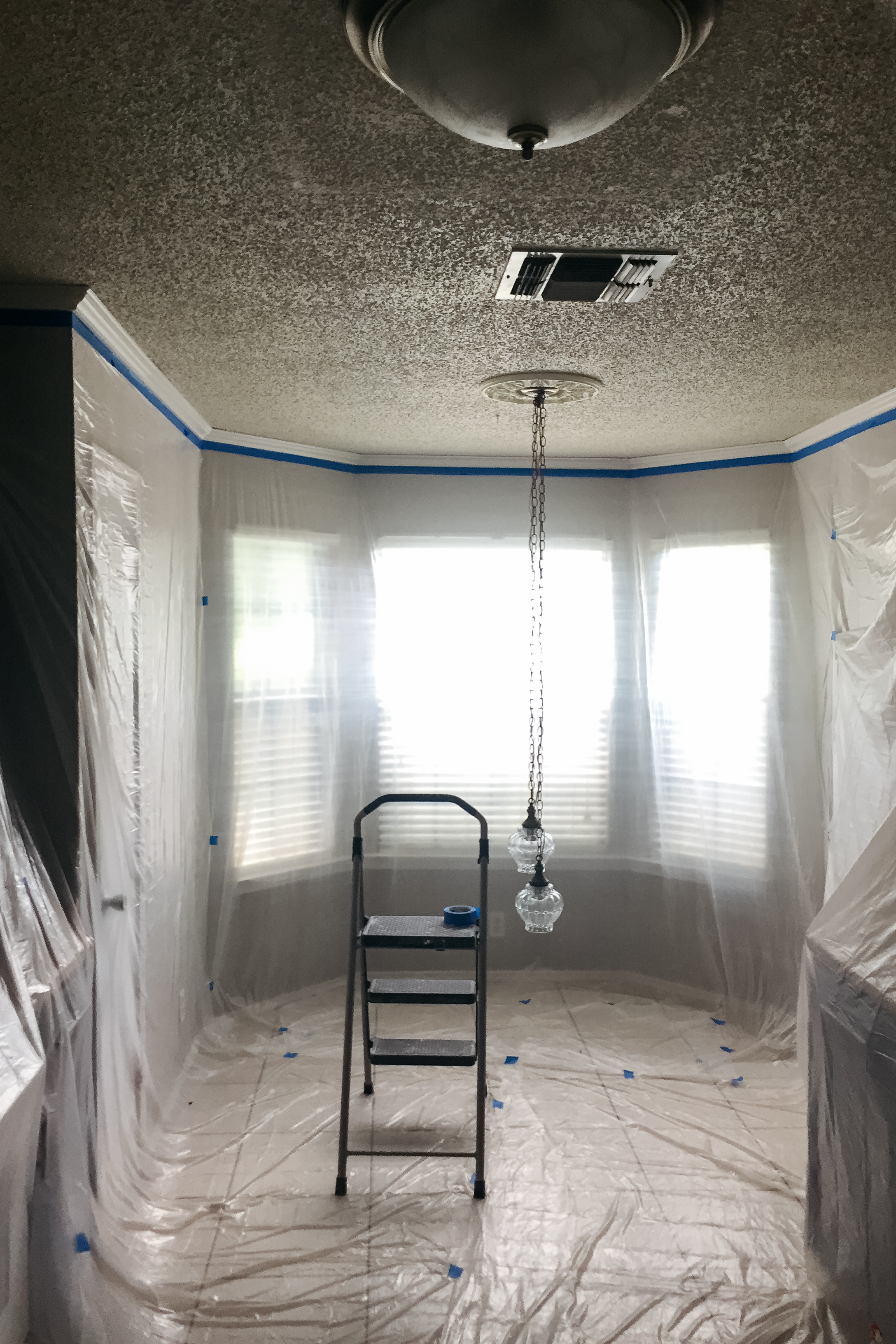
Before the big wall demolition, we scraped off all of the popcorn on the ceilings in the entire house (with the exception of the living room, which we will get to what we are doing there later on). Removing popcorn is a process. I recommend looking it up online if this is something you are attempting, but there are multiple steps with how to do it. First, we had to put up plastic everywhere from floor to ceiling and tape everything off. Next, we had to turn off the A/C so dust doesn't blow everywhere (this was miserable in July and August in Texas). Kyle then sprayed the ceiling with water to get it wet and loosen it up. Then, he scraped away. After all of the popcorn was removed, we painted several coats of paint on top. First the primer, then a few coats of paint after that. Any spots that needed patching up, Kyle had to go over it with cement/a paste to smooth it out. Then we would paint over it a few times to blend it in.
The next thing we did was remove all of the cabinets, countertops, and metal "backsplash". This had to be done piecemeal over a few weeks because we couldn't get rid of everything all at once since we were still using the kitchen everyday. Kyle built and assembled all of the cabinets, and then installed them one by one. After that he installed our countertops - a super affordable butcherblock option from ikea (links below) and new sink from ikea. For the countertops, I really wanted to go with something non-traditional (aka not granite!) and love how it turned out and the contrast between the dark wood and bright white cabinets.
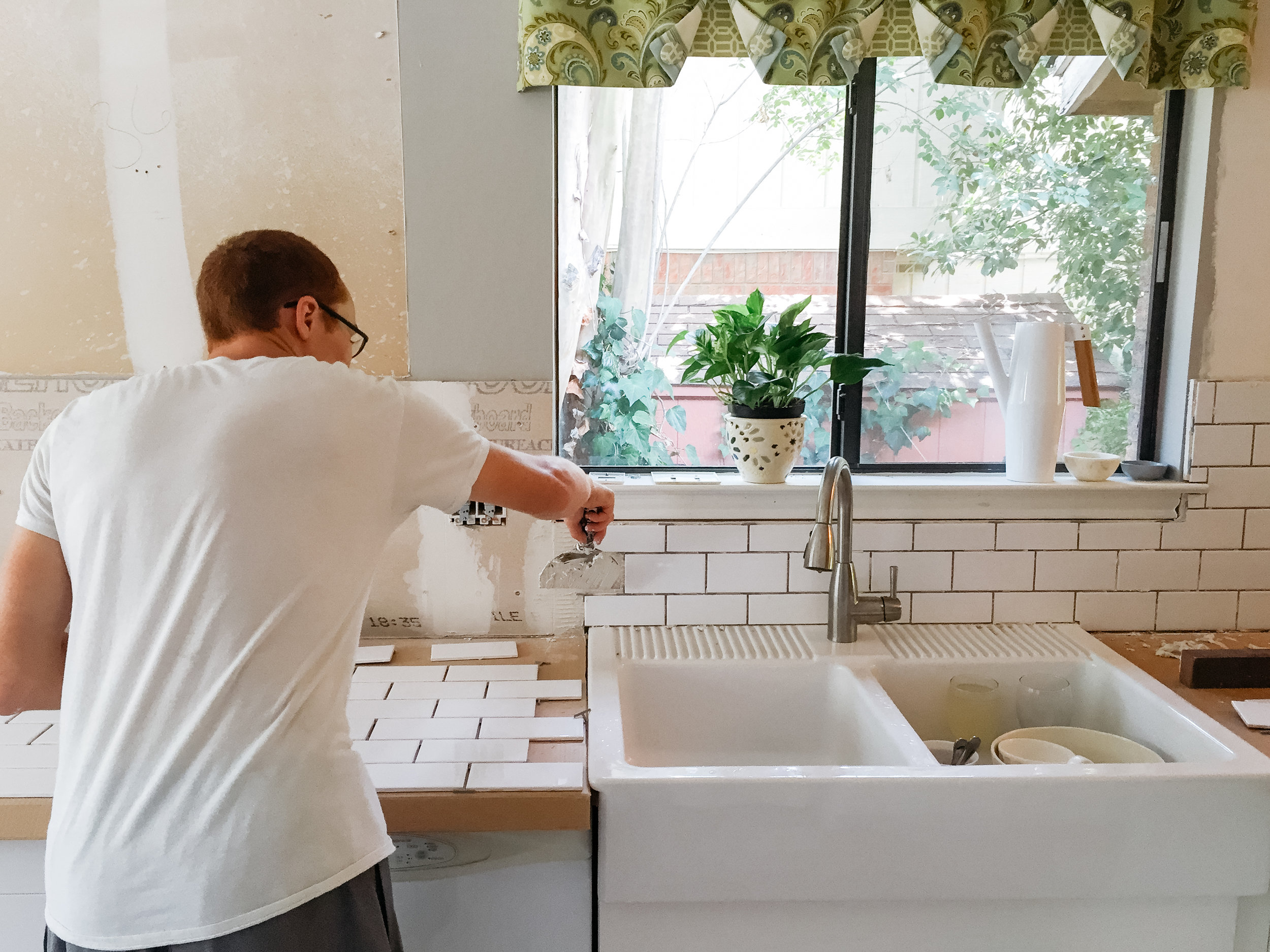
I had looked into a few different tiles for the backsplash but ultimately we decided on the classic look of subway tile. It is also super affordable. Ours was $0.19 per tile from Floor & Decor! I went with a black grout because I just love the contrast it creates. Kyle did such an amazing job with installing the backsplash, especially with having never done anything like it before. It really came out looking professional!!
We had talked about extending the subway tile to the ceiling but I really wanted the clean lines of shiplap in the house somewhere (fellow fixer upper fans, you know where I'm coming from!). I envisioned a half subway tile/half shiplap for the wall where the sink was and really love how it turned out.
To save money, we kept all of the existing appliances. I don't mind them too much though because they are already white and fit in with the theme nicely.
I really love the look of open shelving and while I know some think it is impractical storage-wise, it works really well for us! I use it mostly for props and mixing bowls so it is really useful for me to be able to see everything. Plus it kind of reminds me of a cafe or restaurant in a way : )
The last couple of things we added were the jewelry - aka lighting and rugs. I chose two pendant lights from ikea - in black and white. Lighting makes such a big difference in the overall look and feel of the space. For the rug, I had a very specific look in mind and searched all over the web for something that fit the look I was going for and that was affordable. While I had no idea the rug I ordered online was actually a lot more pink than red in person, it has grown on me a lot and I love the pop of color it adds to an otherwise very neutral space! Scout really loves the rug too as she often sleeps on it during the day.
Kyle and I are both so happy with the kitchen and I feel so thankful to use it everyday!
This post also launches a new section on the site that I am very excited about: #HallAbode! This is basically just a new section on the blog where I will be sharing occasional home decor and renovation posts. We have been hard at work with projects at our new house and I have been dying to share with you all the progress we have made. Stay tuned for more!
We used the Ikea Home Planner Tool to design our kitchen. It was super helpful being able to preview what our kitchen would look like before ordering anything. Highly recommend!
Links
- butcher block countertops
- knobs - similar to these
- sink - similar to this one, but we have a double sink
- knife rack
- subway tile
- rug
- faucet
- pendant lamp above sink
- pendant lamp above breakfast table

